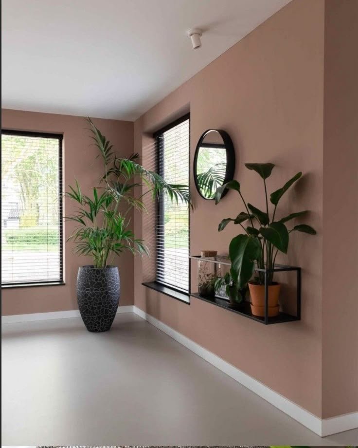
Terracotta and Earth Tones Combination for Homes
Interior colour choices influence how a home feels. While cool greys and stark whites can create a clean appearance, warmer colours often make rooms feel more relaxed, inviting and connected to nature.
A terracotta and earth tones combination for homes introduces the warmth of clay, the softness of beige and the natural character of timber. When balanced carefully, these colours work in modern apartments, family homes and larger residential properties across Kenya.
What Are Earth Tones?
Earth tones are colours inspired by natural materials and landscapes. They include sand, beige, cream, brown, olive green, muted rust, clay and warm taupe.
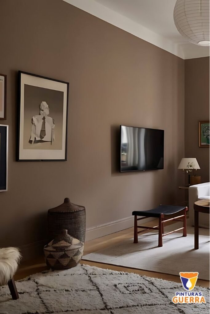
Terracotta sits comfortably within this palette. Its reddish-orange or clay-like appearance can add warmth without requiring bright, saturated colours throughout the room.
The key is to balance the stronger colour with quieter shades and natural textures.
1. Terracotta, Beige and Natural Wood
This combination works particularly well in living rooms. Use beige or warm cream on the main walls, introduce terracotta through cushions or a feature wall, and add timber through furniture, shelves or decorative panels.
The neutral background prevents terracotta from dominating the room. Timber adds another natural layer and helps the colours feel connected.
For a small apartment, consider using terracotta in accessories before committing to a full painted wall.
2. Terracotta, Cream and Oak
Cream and oak create a lighter, softer scheme that suits bedrooms, dining rooms and open-plan living spaces.
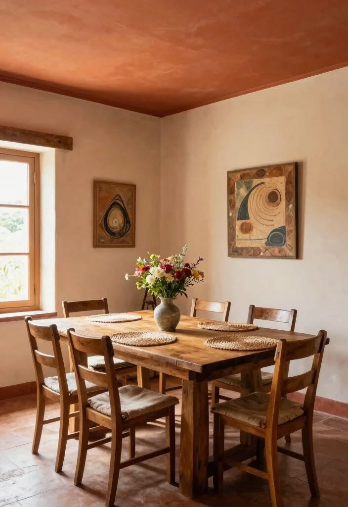
Cream walls can reflect light, while oak-look furniture introduces warmth without making the room feel too dark. Terracotta can appear in bedding, ceramic accessories, artwork or occasional chairs.
This combination is especially useful where homeowners want a warm interior but still prefer a bright, uncluttered appearance.
3. Olive Green, Beige and Terracotta
Olive green introduces a natural contrast to terracotta. The green provides a cooler counterpoint to the reddish clay colour, while beige keeps the overall scheme balanced.
Use olive on selected cabinetry, cushions, accent chairs or a feature wall. Terracotta can be introduced through artwork, ceramics or textiles.
Avoid using too many competing shades of green and orange. Choose one dominant colour, one supporting neutral and a smaller accent.
4. Chocolate Brown and Warm White
Chocolate brown works well with terracotta when a room needs depth. Use the darker shade in furniture, a feature wall or selected cabinetry, then balance it with warm white, cream or light beige.
This combination is useful in living rooms, studies and bedrooms where a richer, more intimate atmosphere is desired.
Lighting is particularly important. Dark brown surfaces can appear heavy in poorly lit rooms, so consider daylight, lamps and ceiling lighting before finalising the palette.
5. Sand, Linen and Natural Textures
For a quieter look, combine sand, warm beige and terracotta with linen, woven accessories, timber and natural-looking finishes.
This approach works well when you want the room to feel layered without relying on strong colour contrasts. Texture becomes the main source of visual interest.
How to Use Earth Tones in Different Rooms
Living Room
Start with a neutral wall colour, then introduce terracotta in cushions, rugs, artwork or a carefully selected feature wall. Coordinate the palette with the sofa and flooring.
Bedroom
Use warm neutrals as the foundation. Terracotta bedding, curtains or a headboard accent can add colour without making the room feel busy.
Kitchen and Dining Area
Timber-look finishes, beige cabinetry and terracotta accessories can create a welcoming atmosphere. Consider how the colours work with the countertop, backsplash and available daylight.
Home Office
Earth tones can create a calm background. Use darker browns sparingly and ensure the work area has adequate task lighting.
Use the 60–30–10 Colour Rule
A practical starting point is to allocate roughly 60% of the room to a dominant colour, 30% to a supporting colour and 10% to accents.
For example, warm beige could cover most walls, timber and brown could provide the supporting layer, and terracotta could appear in accessories.
This is a guideline rather than a strict rule. The best proportions depend on room size, lighting and personal preference.
Mistakes to Avoid
Too much terracotta can make a room feel visually heavy, particularly when combined with dark furniture and limited daylight. Equally, using several unrelated earth tones can create a muddy appearance.
Test paint samples in the actual room and view them at different times of day. Coordinate paint, flooring, furniture and lighting before purchasing large quantities of materials.
Interior Design Support from SUIMAS
SUIMAS Interiors helps homeowners coordinate colour palettes with furniture, flooring, ceilings and other interior finishes. Our interior design services can help you create a consistent look from room to room.
Explore our modern home interiors and residential interior design resources for more ideas.
Planning a warm, contemporary home interior? Contact SUIMAS Interiors to discuss your design and finishing requirements.
Call/WhatsApp: 0717 044443 / 0739 255050 / 0725 021709
Related Post Resources
- Warm and Comfortable Interior Finishes for Homes in Eldoret
- Modern Home Interiors
- Apartment Interior Design Services for Modern Living in Kilimani
- Living Room Interior Design
- Kitchen Renovation Cost in Kabete
- Holiday Home Interior Design in Diani
- Flooring Options and Installation for Homes
- Gypsum Ceiling Installation
- Kitchen Renovation Services
- 3-Bedroom House Interior Design Services